Respect to Google Blogger for giving it a good try, but I finally got fed up with my site crashing the iPad and iPhone browser, not having a mobile-optimised layout for smartphones, outdated look & feel, and being generally disconnected with the new social media like facebook and twitter.
Blogger is to Google what Flickr was to Yahoo! - once they bought it, they just sat on it and didn't improve it at all. The recent addition of "Template Designer" as a beta feature is just way too far behind the curve.
I've redirected my willhains.com domain to tumblr, but this blog will stay available at http://willhains.blogspot.com/ indefinitely, unless Google shuts it down.
I did manage to use an awesome tool to import all my posts from Blogger to tumblr, but unfortunately comments cannot be imported. After this post, all my new posts will go to tumblr.
I also used this as an opportunity to install a new theme (holy crap the themes over at tumblr are beautiful!!) and get some sexy HTML5 typography going. I'm really pleased with how it looks now.
Friday, June 11, 2010


Marco.org (Instapaper) on iPhone multitasking and background updating
Marco:
The addition of one more multitasking service would solve this issue for a lot of application types: a periodic network request. Here’s how I would do it:
- The application gives the system an NSURLRequest and an ideal refresh interval, such as every 30 minutes, every few hours, or every day.
- iOS executes that request, whenever it deems that it should, and saves the response to a local file.
- Next time the application launches, iOS hands it an NSData of the most recent response.
A tidy idea.
Maybe one of the reasons Apple didn’t include this is the privacy concern that it might be possible for a developer to geolocate a user and track their movements by examining the source route of their http requests. That would be difficult for Apple's app "curation" process to catch, since the offending code would be running on a remote server.
Sunday, May 30, 2010
Apple to announce iPad nano?
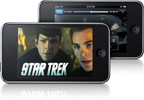
The tiny device, measuring less than half the height and one-third the width of the 1st-generation iPad, which had its international debut on Friday, will feature a 320x240 capacitive touch display, and many of the same features as its big brother.
"It's going to be a big hit. Imagine an iPad that you can carry right in your shirt pocket!" said a source familiar with the matter. "The new form factor will introduce a whole new paradigm shift, and yet another gold rush for developers."
The price point at launch is unknown at this point, but some say it will debut at around $199.
Saturday, May 29, 2010
Irrepressible, Art
After only 1 day playing with my iPad, it's clear that the "beautiful" apps own this space. I'm sure we will see the same deluge of fart apps and just plain ugly apps that we have on the iPhone, but on iPad, the really gorgeous UIs stand out more than they do on iPhone. And with the higher price tags that for now seem to be the norm, users will expect more and demand better.
But "beauty" is not a requirement to publish apps on iPad, it's an impulse—an irresistible urge. To me at least, it seems that if you give some people a canvas, they cannot help themselves but create art.
Take TV advertising as an example. The job is simply to tell people about your product, and how they can get it, within the time constraints imposed by the platform. But many ads on TV stand up on their own (without the product) as beautiful art. It's a similar story for printed ads, buildings, built-in computer alert sounds, business cards—basically any human activity where discretion is allowed. People are addicted to their own creativity, and everybody benefits.
I wrote before that Apple gave iPhone OS developers a forced lesson in UI minimalism. And now there is no excuse for getting it wrong on iPad. There are oodles of pixels to work with, plenty of grunt to push them with, and a big reservoir of power in its twin batteries. To help even more, the typical iPad usage session is many multiples of the iPhone. You have the full attention of a comfortably seated, wide-eyed audience.
Better give them art.
- posted from my iPad
Saturday, May 22, 2010
Craig Venter unveils "synthetic life"

We can create a new species of life by artificially synthesising DNA, but we still can't fly to work by rocket pack?
What's that about?
Sunday, May 16, 2010
Sennheiser Bluetooth Headset for iPhone

I just took delivery of my new Sennheiser MM100 Bluetooth headset. It cost ¥19,800 from the Apple Online Store. Sennheiser are a very well-respected professional audio device company, and the comments on the online store were very positive. So after some ums and ahs I clicked Buy.
They seem to work as advertised, and I had no problems pairing them to both my iPhone and my iMac. The sound quality seems to be excellent, although I usually try to reserve judgement on the sound until I've used them for a week or so.
I can't comment on battery life yet, but according to the manual they will handle 7.5h of continuous audio, 9h call time, and 220h (about 9 days) of standby time. Not bad!
I think the thing I am most impressed by is how comfortable they and light they are. I was expecting it to be awkward to put them on, but they're a lot easier to wear than other wrap-around headsets I've tried. I jumped around a bit and they didn't fall down or even move. The over-ear plastic part starts to irritate the top of my ears a little bit, so I'll try some different angles and see if it improves. I don't seem to have any problems wearing them with glasses, either, which is a relief.
I'm not really used to wearing large headphones (I have always bought earbuds until now, but I haven't found any good Bluetooth earbuds yet), so to me it looked kind of weird in the mirror. We'll see if it gets funny looks on the street...
One more thing I noticed is that the blue indicator LED on the right side reflects on the inside of my glasses, so I can see a little blue flashing light in the right periphery of my vision. Ironically, this has actually helped with the setup, as I didn't need to take them off to check what the indicator LED is doing! I wonder if this would be distracting enough to be dangerous. It's probably only noticeable in a dark room, so hopefully it won't cause me to crash my bike!
Anyway, just a first look for now. Not ready to give my recommendation yet, but so far it seems pretty good.
Update 1: The next/previous buttons don't work with iPhone, so there's no way to skip forward or back via the headset. Not a huge deal, but disappointing given that iPhone does support this with other headphones.
Update 2: I've been using the MM100 in anger for more than a week now, and it's still on its first charge! The battery life is incredible.
Also, after listening to Björk's Homogenic and others, I am completely satisfied in the sound quality. This is by far the best bass I've heard on casual earphones, which is pretty amazing considering how light they are. The high end is bright and sharp, and the mid tones are warm and have nice depth. The only problem is that since the earpieces are not sealed at all (as I'm used to with earbuds) sound from outside is clearly audible, so in noisy settings you don't get to actually enjoy the full depth of sound they provide.
I find that maximum volume is not very loud (a European thing?) and I tend to use them at this level or just below.
Given the beautiful sound quality for music, the crappy sound quality for phone calls is inexplicable, and inexcusable. First, ring tones are so overdriven and distorted that they all sound like they're being played with a bad electric guitar. Second, the sound of the other person seems to drop in & out, kind of like using a speakerphone. I haven't tried being on the other end of the call to see what I sound like yet.
As for the wear, I still find it can irritate the tops of my ears after long usage, although I usually don't notice it until I take them off. Otherwise, they are extremely light and comfortable to wear. They do look a bit funny though. One guy commented that I look like the flight controller on the Death Star.
I find the controls work fine and are not intrusive. The volume is controllable from both the headset and the iPhone, so you can reach for whichever is convenient at the time. The lack of next/previous is a disappointment, but so far hasn't produced more than one "aargh!" moment, thanks to the iPhone's lock screen home-button-double-click iPod controls.
Saturday, May 15, 2010
Kernest Fonts, Mars Edit

Decided the old look of my blog was getting tired, and there are so many beautifully designed blogs out there. I am very attracted by the elegance of tumblr, but there's no way to completely migrate my entire blog (including comments) from Blogger to tumblr, so instead I opted for redesigning the look on Blogger.
I did some poking around and came across Blogger's new (beta) Template Designer, which not only has some more modern themes to start with, but a lot more control over the layout and colours. Settled on this look for now, but very easy to change later.
But I was still unsatisfied with the look of the text — too mundane. I immediately fell in love with the text on Valhalla Island. I did some investigation and finally figured out how to get this awesome Droid font embedded into my Blogger page. There are several ways to do it, but I found this useful article explaining how to do it using the Kernest service.
Inspired by Daring Fireball, I downloaded Mars Edit, a desktop editor for composing and publishing to a blog. I've used it for the last 3 posts and have to say that while it isn't perfect, it does solve nearly all of the problems of the web-based Blogger editor. I'm looking forward to future updates.
Sunday, May 09, 2010
My iPhoto Workflow
As mentioned previously, I've just switched back to iPhoto after a few months using Aperture 3. One of the reasons for doing this was that I found the workflow in iPhoto to be as good as, if not better than, the most-recommended workflow in Aperture.
I promised to explain my workflow in iPhoto, so here it is. I hope someone finds this useful.
Step 1: Import
iPhoto's import process is pretty smooth, so this step doesn't need much comment. When you plug in your memory card it jumps to the import screen right away and starts bringing up previews of the contents of the card.
I usually don't bother to type the event name at import time, as there are often multiple events on my card, but I always choose Autosplit events after importing and Hide photos already imported. My events settings are shown below, with Autosplit set to Eight-hour gaps. I find this is a good middle-ground setting to use, but this is really a personal preference and doesn't really affect the workflow much.
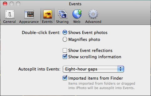
I always use the Import All... button to get everything off the card quickly. You don't want to mess around with picking out images while they are still on the card. Just get them onto your hard disk and have iPhoto wipe the card when prompted. (Note: if you are really paranoid, you can kick off a Time Machine backup when iPhoto shows the Delete photos from your card? prompt.)
Step 2: Event Merging & Splitting
The first thing I do once I have the images in iPhoto is clean up the boundaries between events. Usually, with the 8-hour gap setting above, iPhoto gets it mostly right, but depending on the shoot it might split them up too finely or clump multiple things together. If the photos are from a multiple-day trip somewhere, I prefer not to put them all together into a single event, but rather have each event in iPhoto represent an activity or episode of the trip. (Note: one advantage Aperture has here is the ability to group events into folders. In iPhoto you just have to rely on the chronological proximity of the events to keep them together. However, I don't find this to be a problem at all.)
The best way to do this is on the Last Import view that is shown automatically after importing. Make sure you have event titles displayed (View > Event Titles). Just use drag-and-drop to merge events, and the Split button at the bottom of the screen to split them. Give the events titles – preferably the title you would use to publish a Set to Flickr.
The rest of the workflow is per-event, which is useful for breaking the work of processing images into manageable chunks.
Step 3: First Pass - Picks and Garbage
This step is equivalent to the "stack sorting" and "rejection" steps of the Aperture workflow, rolled into one.
I select the first image in the event, and hit the Space bar to blow it up to fill the iPhoto window. Then, I simply use the Left/Right arrow keys to quickly flick through the images, and the Delete key to "reject" unwanted ones.
This works great for "stack sorting", because it is very easy to find a sequence of shots that are very similar (e.g. where I have been trigger happy with the high-speed shutter on my 50D). I love being able to quickly flick back and forth between shots in-place to decide which is better. I find that comparing images side-by-side makes this harder, but by flicking between shots in full-screen lets me keep my eyes on the focus point, or notice subtle differences.
The reason I delete the non-picks is because I never want to see them again. If I make a mistake, I can easily fish them out of Trash. Better yet, when I finish processing a session I can empty the Trash and recover tons of disk space.
Apart from non-picks, I also use this step to get rid of "rejects", i.e. photographic failures like closed eyes, unrecoverably wrong exposures, out-of-focus shots, and accidental shots.
The key with this step is ruthless efficiency. I want to cut down the number of images as early as possible, so I try to rip through them quickly and just delete as much as I can stomach.
iPhoto just wraps around when it gets to the end of the event, so keep an eye out for that to avoid going through them all again. You can always hit the Space bar to quickly go back to thumbnail view to check where you are.
Step 4: Second Pass - Name Faces
The Faces feature in iPhoto '09 is pretty good but not 100% automatic, so you need to actually confirm the faces it finds. Trying to do this retrospectively over an entire photo library is extremely painful, and the lack of a "show me all the unnamed faces" feature makes it even worse. So I like to get this done on a per-event basis as I add them to my library.
In thumbnail view, select all images with Cmd-A and choose Detect Missing Faces from the right-click popup menu. Watch the little spinning arrows next to the Faces folder, and when it stops, click the Name button at the bottom to go into face naming mode.
I like to use the keyboard as much as possible here. You can press Tab to move through all the faces found in each photo, and type or accept iPhoto's guesses with Enter. Unfortunately I haven't found a keyboard way to remove faces iPhoto has detected; you have to use the mouse for those. And of course you need the mouse to use Add Missing Face.
Step 5: Third Pass - Editing and Losers
At this point, I have weeded out all the photos that will never make the final cut, and iPhoto now knows where all the faces are (which is important, as we'll see). Now we are down to serious photography, so it's time to go full-screen (Cmd-Opt-F) and make use of that nice big shiny Mac monitor. (It might be a good idea to lower the ambient light in the room to minimise reflections on that nice big shiny Mac monitor, too...) At full-screen, this is the biggest the photos are ever likely to be displayed, so if they look good here, they'll probably look good everywhere.
The objective of this step is to make photographic adjustments, and decide the final cut. iPhoto's full-screen mode is its edit mode. I look at each image, make adjustments if needed using the editing tools, and decide if it's a winner or a loser. If it's a loser, I use Cmd-L to flag it as "hidden", which removes it from view and goes to the next image. (Note: if iPhoto doesn't move to the next image when you hit Cmd-L, you probably have it set to display hidden photos. Use Cmd-Shift-H to turn this off.)
A few tips for making adjustments:
- If you shoot in RAW (you should if you can), you can recover a tiny bit of detail from washed-out areas by holding Option when using the Adjustments window. The Exposure slider changes to a Recovery slider.
- The magic wand Enhance button is pretty damn good considering the difficulty of its job. I often use it as my only edit, or at least as an excellent starting point. It is particularly good at finding the correct white balance.
- Having all the faces identified is a big help for editing, since photos containing faces automatically have the Avoid saturating the skin tones option checked.
- Cropping is often a great edit. iPhoto's cropping tool includes the 3x3 grid so you can find those "rule-of-thirds" sweet spots. But don't crop too much, because obviously this will reduce the resolution of your image.
I try not to make too many edits, because it reduces overall image quality (no matter what tool you use), and as a general philosophy I think it's better to try to get good shots to begin with. If I find a photo is still not satisfactory after 3 or 4 edits, I usually give up on it and mark it as a loser.
Update: As pointed out in Larry's comment below, it is important to note that editing doesn't affect the quality of the original image at all. You can always revert to the original if you mess up. The point I was trying to make here is that trying to squeeze too much out of a photo with edits can impact the output image quality.
Step 6: Pick of the Shoot
By this time, I usually have a favourite shot in the event, or at least a couple of candidates. I go back to thumbnail view, maybe preview them with Space if I need, and choose my overall best shot. I make it the "key photo" of the event by right-clicking and choosing Make Key Photo.
The nice thing about this is it means my Events view is automatically a single view of just my best shots.
Step 7: Places
I don't usually bother to get my places down to exact coordinates, so at this point I finish off the event by going back to the Events view and clicking the little "i" icon in the corner of the event tile to set a location for the entire event. This will apply to all the photos inside.
Step 8: Publish & Share
As I've noted before, it's important to get your photos polished and put them out there as soon as possible after the shoot. Personal photos are like fruit; they are much better fresh.
Since iPhoto has built-in ability to share on MobileMe, Facebook and Flickr, and it can even keep the online albums up-to-date automatically, I tend to just publish to all three. In a way, it's like having three online backups of all my photos in addition to my Time Machine – that's pretty safe!
I also like to create & purchase photo books from Apple if I want to keep the photos out on my coffee table for visitors, or send a copy as a gift to people who were on the trip with me. This is especially suited to non-technical family members.
You could even make a slideshow and export it as a movie for iPhone, MobileMe, YouTube, or a DVD. Whatever it takes to get the photos out into the world where they will actually be seen. After all, that's the point isn't it?
OK that's it! Repeat steps 3 to 8 for each event.
Ratings
Although iPhoto has the same 5-star rating system as Aperture, I find I don't really need them. The rating system most Aperture users recommend maps to my iPhoto workflow as follows.
- × (rejected; something photographically wrong) = Trash
- Non-pick of stack = Trash
- ★ (technically OK) = Hidden
- ★★ (might be OK with processing) = Hidden
- ★★★ (Flickr-worthy) = Not hidden
- ★★★★ (pick of the shoot) = Key Photo of event
- ★★★★★ (one of all-time best) = "Best Shots" album
I have an album set up called "Best Shots", where I put my all-time best pictures. I don't use Albums for anything but this, as I find Events have pretty much replaced them functionally.
So there you have it – that's my iPhoto workflow. I hope you find this helpful. Let me know what you think in the comments.
Friday, May 07, 2010
Going Back to iPhoto... Sorry Aperture
I wanted to love Aperture 3. I really tried to love it. But after giving it a very decent chance, I have to say it hasn't floated my boat. That is to say, it hasn't offered a significant value proposition over iPhoto – certainly not ~$200 worth.
Aperture 3 was basically a catch-up to iPhoto '09. It improves slightly on the Faces and Places features that iPhoto '09 introduced, but the improvements are small UI changes which would be – and probably will be – easily adopted in iPhoto '10 when it comes out. But I can't shake the feeling that this is lipstick on the pig. Aperture 3 looks gorgeous, like a true Apple UI. But it can't match the intuitiveness and minimalism of iPhoto '09.
Maybe I'm missing something important, but the main advantages Aperture 3 offers over iPhoto '09 seem to boil down to the following:
- Stacks
- Editing
- Workflow
- Um....
Stacks
This is a nice workflow feature for the first pass over a shoot when you get home. It is especially useful if, like me, you like to set the camera to rapid-fire and hold down the shutter button.
But unfortunately the UI for stacks is very finicky, and the end result is I have huge numbers of photos on my hard drive that I don't and will never want.
The equivalent in iPhoto is really simple. All I do is use the space bar to preview the image at maximum size, and use the left & right arrow keys to compare them, and just delete the non-pick-worthy ones. They go to iPhoto's Trash folder, so if I make a mistake I can easily undo with a simple Cmd-Z.
Editing
Without a doubt, Aperture 3 is a fantastic photo editing tool. The sheer number of adjustments and controls available is incredible, and the UI for applying them is genius. I love the way they can be added and removed, previewed, brushed in & out and feathered, the edge-awareness, batch editing, etc. Just brilliant.
But in reality, when I come home from an overseas trip with 2,000+ images to process, I can't realistically spend a lot of time fiddling and tweaking the photos. Usually, if it's not a good shot straight off the camera, it goes in the bin. I also find that the quality of photos generally declines as you play with them. The bottom line is: If it's a bad photo to begin with, no amount of editing will make it a good photo.
But for what it costs (nothing), iPhoto is no slouch at editing either. If you have a good photo to begin with, iPhoto gets the job done extremely well.
One often-cited advantage of Aperture 3's editing is that it is non-destructive, i.e. the original "master" photo stays as-is, and all the edits are stored as tiny metadata and applied dynamically every time you view or export the image. This is certainly elegant, but the argument that it saves disk space is ridiculous when you consider that behind every stack there are photos you will never use, and behind the default "Unrated or better" view are hundreds of "Rejected" photos you never even see, all stored on your hard disk. The benefit of iPhoto's approach is that it's very fast to view and export.
Given that I went and paid for the damn thing, I'll keep Aperture 3 around for the occasional special editing task.
Workflow
I don't really see a workflow emerging from Aperture 3 - it is just a tool; you still need to come up with your own workflow that uses it. I had a pretty smooth workflow in iPhoto (perhaps the subject of another post) which worked just fine – in fact it was as good if not better than the most commonly recommended workflow in Aperture.
But the most infuriating things about Aperture's workflow are the beginning and the end.
The import process in Aperture is intensely unsatisfactory. In iPhoto, you plug in your card or camera, and it immediately recognises it and displays the import screen. In Aperture, there are a lot more clicks.
After the import, iPhoto asks you if you want to delete the photos from the card. So does Aperture, but for some reason it asks you twice, and then it doesn't even seem to work – every time the card is ejected before it is wiped clean.
In iPhoto, once you've done an import, you're done. For some reason, Aperture spends ages "Importing" the photos after you've pulled them off the card. And while this is happening, the performance of the application – no, the whole computer – suffers noticeably.
But much worse than import in Aperture is how you actually use the photos for something useful after processing them. Aperture 3 inherited the Flickr, Facebook and MobileMe support from iPhoto '09, and it's basically the same, but iPhoto remembers what you've uploaded and you can easily control the online albums from right within iPhoto.
iPhoto has a very fast file export as well, probably due to the pre-rendered edited copies of each photo that it has; but Aperture seems to take forever to export images.
The most annoying thing of all is the integration with the rest of the Apple universe. iPhone (and presumably iPad) syncing is fantastic with iPhoto, but pretty much sucks balls with Aperture. All other applications on the Mac know how to get photos from iPhoto, but not Aperture. Even the Mac screensaver doesn't seem to know how to use the filters in Aperture.
Um....
I'm sure there are a lot of other features in Aperture that I've overlooked and/or not discovered in my 3 months of usage. But if those features are so great, why were they not discoverable? I watched every inspiring introduction video on Apple's website...
Maybe Apple isn't Good at Pro?
I can see how Aperture might have made sense before iLife '09, especially for those who have truly huge libraries and needed a way to organise them, but with the tiny amount of effort it takes to use Faces and (to a lesser extent) Places in iPhoto, there really is no rational reason I can think of to do any manual organising anymore.
I had a similar, if not more extreme, reaction to Final Cut Express vs. iMovie. I'm starting to think that while Apple excels at casual, consumer-level software design, they are not so good at the professional stuff. In the case of Final Cut, it was patently obvious that there is a backward compatibility problem: (Probably) thousands of professionals make their living with Final Cut, so Apple can't afford to mess up their workflows by changing the UI, even if it is a huge improvement. Perhaps the same is true for Aperture.
iLife apps don't have that problem, so both iPhoto and iMovie got major changes in '08 and '09, and are now much, much better as a result.
And now we are seeing some seriously functional stuff on iPad... I am getting the impression that Apple's special talent is to provide all the functionality in a simple, intuitive, discoverably deep UI experience, which can and should render obsolete the need for "Pro" applications.
Saturday, February 06, 2010
Why Most iPad Reactions are Missing the Point(s)

I've let the concept of the iPad marinate in my head for 10 days, and let the waves of reactions flow over me.
As always, the volume and strength of arguments about several aspects of the iPad are completely out of proportion to the actual number of people that agree and disagree with them, so reading the what must be hundreds of thousands of media articles, blog posts, tweets and YouTube videos about iPad is not going to give a faithful picture of how it will fare in the wild. It's a safe bet that Apple will wield its formidable marketing muscle to ensure the iPad's commercial success. That's a given. Since Mac OS X, there hasn't been a single Apple product I can think of that didn't. Even Mobile Me has done better than .Mac ever did, despite being an utter cock-up.
A few articles that surfaced over the last 10 days have, amid the noise, brought a sharp clarity to the true vision behind the iPad, and even placed the iPhone and iPod into a much, much larger picture. I now believe that almost all reactions (both positive and negative) have missed the point.
iEverything
iPhone and iPad are just beginning to fulfil a very very old dream of a device that can morph into any device and be the perfect design for every task. The soft keyboard, the big touch screen, the lack of physical controls - all point to a singular philosophy: the hardware should get out of the way and let the software do its magic.
Every aspect of the hardware design of iPhone, iPad, and even iMac, reflects this philosophy. There is nothing to distract from the software. In fact, the software replaces the hardware wherever possible. Of course software needs hardware to exist, but iHardware is all about supporting the software, and nothing else.
Taking this philosophy to its logical conclusion, the iPhone and iPad will eventually evolve to have no recognisable physical controls at all, and when they run an app, they will look and feel exactly like the physical device normally used for that task. The hardware will vanish into the background as the software defines everything about the user experience.
Another implication of this philosophy is no background apps. Other than a few special cases, I really don't see the point of background apps. Most of the best iPhone apps I use are designed to remember what you were doing when you last quit, so when you bring them back up, there is no functional difference to having them running in the background. In light of the above philosophy, background apps would be a huge mistake. The whole idea is to make the device transform into something else - the device becomes anything, but not everything all at once.
iCloud
Apple is making titanic investments in online services. The iTunes Store and App Store have shown what it takes to perfect the micro-payments business. It's all about the user experience - again, it's all about software. I've never liked web apps. While Google is stretching the envelope further than anyone thought possible, the problem is that it's a stretch. Apple has shown that limiting business to web-based user experience is a waste of the true potential of the Internet. By building native apps that deliver a thoroughly pleasant interface on the front end, while using the Internet and huge farms of raw horsepower on the back end, they create the perfect user experience. The problem with web apps is that the client is too thin.
iPhone apps have shown that there is a happy medium between fat desktop client software and paper-thin web client software. You don't need more power than a mobile ARM processor to deliver a smooth user interface on a small screen, and when you couple that to a powerful online back-end you effectively have an iceberg, with the app as the tip.
The main limitation faced by iPhone apps is the size of the screen, which iPad addresses directly. The larger screen, with a muscular chunk of silicon to drive it, will make more things feasible on the front-end, but the concept is the same. The genius stroke is that thousands of iPhone app developers have now been through a forced lesson in user interface minimalism. The discipline of designing powerful apps on a small touch screen means that moving to the iPad is a new freedom, rather than a limitation as a 1024x768 screen would have been if there was no iPhone before iPad. But the transition to iceberg apps has already happened.
iType
Prior to the announcement of the iPad, like others, I wondered how text input would be handled on a tablet. This is one area I think Apple still hasn't quite figured out yet. (Nobody has.) The lack of physical buttons is a great freedom for the "magical morphing device" design philosophy, but let's face it - typing on the iPhone is not easy. I expect typing on the iPad will be even harder. I'll have to wait and see.
So one of the functions gushingly touted in the Apple promo videos was how great it is to do email on an iPad. Hmm… It looked great for reading email, but I will be surprised if it's any good for writing email.
Apple has obviously been forced to admit this limitation, because they introduced the keyboard dock right in the debut presentation. But since nobody has any better ideas, the race is on now to come up with a real solution.
iChat
The only real disappointment I have is the lack of a front-facing camera. If Apple had included one they could have had 2 killer apps: YouTube recording & upload, and video iChat/Skype. Coupled with 3G, these would have introduced a new form of communication, which is ultimately the only important thing that computers do. I think this really was a missed opportunity for Apple, and I hope they will introduce this in a future generation of iPad.
iCarry
Given that I won't be able to use the iPad for iChat/Skype with my family in Australia, I'm now wondering if I will ever take the thing out of my house. If not, the WiFi-only version will suffice, as there's no point in having GPS if it's always at home. Normally, I don't carry a bag anywhere, even on my commute, because everything I need is already on my iPhone. So carrying an iPad around by any means would automatically be a hassle. That said, if I ever do take it out somewhere, it will be a lot less useful without connectivity.
iWant
The iPad could have been more, but it would have to be a whole lot less for me to not buy one. One overwhelming trend I have seen in the blogosphere is people bashing the iPad, but saying they still plan to buy one. If that is anything to go by, then Apple is going to sell a lot of iPads. Even people who say they hate it, still can't help but want it!
Sunday, January 31, 2010
iPad vs Kindle
Blogs seem to be heating up already about whether the iPad will kill the Kindle. I just read an article listing 10 reasons iPad will crush Kindle.
Although I agree with the 10 items on the list, I think there are a few things Kindle still has going for it.
(I own neither an iPad nor a Kindle, so the following is based purely on tech specs and a very brief hands-on with a Kindle.)
1. Kindle's screen may not be colour or support video, but it really is amazing. I can see that it would be comfortable to read for hours.
2. Also thanks to its screen, Kindle's battery life dwarfs iPad. And there's no need to worry about turning it off if you get distracted with something else. You just put it down and leave it. Just like a book.
3. Kindle is much thinner and much, much lighter. Many people enjoy reading in bed - can you imagine trying to hold a 730g iPad with one hand while you keep the other arm warm under the covers? Even the big Kindle is only 290g.
4. I agree Apple has dominated the online music buying experience, but Amazon is THE biggest and most international bookstore in the world. The iBookstore is in the U.S. only. Amazon is still the gorilla in this jungle. The iTunes Store filled a vacuum. No such vacuum exists for eBooks. (However, I will admit that Kindle hasn't sold well enough to be considered a done deal.)
5. Touch interface sounds easy, but it's not always. Nobody of any age will have trouble with the Kindle's buttons, but with a touch screen it's so easy to accidentally tap something without meaning to. If you watch the iPad demo carefully, you can see Steve doing this.
Okay, so I've only got 5 reasons to support the Kindle, so maybe iPad will eventually eclipse it. I'm just saying - it won't be as easy as Ben Elowitz and others make it seem, and it won't be overnight. Apple's got some work to do.
Sunday, October 25, 2009
Tokyo Bay Timelapse
I finally got my shutter release timer from Hong Kong. It works great! Here is the latest attempt:
The original source video (sequenced from the original photos) was stunning, but I find I'm having a lot of trouble getting good quality output from iMovie '09. There are a lot of people complaining about it, so I guess it's iMovie and not just me. In frustration, I bought Final Cut Express 4, but it won't arrive for a few days so I guess we'll see the improvement in the next video.
I've seen a lot of other great time lapse videos on YouTube lately. There are a lot of really talented people out there. It seems to me now that the true secret is to think of it as a photo with some life breathed into it. The best time lapse videos I've seen would be beautiful as still photos. Adding the time lapse component just gives the photo a bit extra. Adding music, pan and zoom adds mood. But it should start with a beautiful and interesting photo.
Saturday, October 17, 2009
Time Lapse
I ran across mockmoon2000's YouTube channel a couple of weeks ago and started what may turn out to be an obsession with shooting time lapse videos.
Below is my latest attempt, shot with an old video camera hooked up to my neighbour Joe's Mac Mini in webcam mode, using open-source software Gawker to create the movie. I edited it using iMovie '09.
The resolution and image quality was not very good, so now I'm waiting for a timer shutter release trigger to be shipped from Hong Kong, which will allow me to use my Canon SLR to create higher-quality, smoother videos. So hopefully in a few weeks I'll post something really nice.
Enjoy. ;-)
Thursday, October 15, 2009
kill -3 to the rescue!
A basic and ancient weapon to keep close at hand when hunting down deadlocks and other weird threading issues in Java applications is the kill -3 command. I don't know of an equivalent on Windows, but if you are running on any flavour of Unix (including Mac OS X) it is available via the command line.
If you've never tried it, basically it gives you a dump of the stack traces of all living threads in the process. Despite the name, when you use the -3 option, it doesn't kill the process. This is handy if you want to take multiple snapshots a few seconds apart to see if anything changes.
Even better, it also shows you what objects have been locked, where, by which threads; and which objects are waiting for those locks. In no time at all you can find the source of the deadlock and do something about it.
I've only used this in development, but there's no reason you couldn't use it in production, provided your stdout and stderr are redirected somewhere you can see. Since it doesn't kill the process, it's entirely plausible you could find a workaround for some problems on the running system.
Monday, September 21, 2009
Extreme GTD Makeover

Most GTDers I know go through periodic changes of their systems, either by moderate incremental tweaks, or by the occasional, revolutionary, "back to the drawing board" re-think of their tools and methods. Personally I have done this with my Outlook-based GTD system 5 or 6 times in the past 3 years.
But my latest re-invention was by far the biggest since I started GTD. This time, I really think I've nailed it. What's more, for the first time, I have switched to paper. And I'm loving it.
Those who know me would never imagine that I would use an analogue tool for anything that has an even half-functional digital equivalent. (I have a accelerometer-based spirit level app on my iPhone for crying out loud - and I've used it!)
But like many others I have discovered some of the magical and practical properties of pen & paper. For example, on paper, if you suddenly notice an association between two things in a page of notes, you can simply draw a line or arrow to link them without having to think about how.
My new system, which I've been using for about a month now, is a return to GTD basics. I call it "almost-pure" because for the first time I am following almost all of the techniques in the book almost exactly, with just a few important modifications. So here it is:
Motivation
There were 3 main problems that drove the design of this system:
- The nature of my job has changed, taking me away from my desk for most of the day. I'm in meetings a lot, and needing to return to my desk to check my lists was driving my working hours way up. I needed a portable system, and iPhone apps weren't cutting it.
- Over 3 years, my previous GTD system had become quite cumbersome. I realised the overhead of maintaining it was getting in the way of actual work, again affecting my work hours. I needed an extremely lightweight system, that I could get up-to-date really fast.
- I found that many Actions were lingering on my lists, becoming less and less relevant as they aged. I needed a way to keep my system fresh and alive, where an important Action is not lost in the noise of numbed-out actions that had lost their meaning.
Ingredients
You will need:
- 1 Calendar (for this, I still prefer electronic, for the ability to have pop-up reminders)
- 1 Notebook
- 2 Pens (different colours for notes, etc.)
- 1 Highlighter (optional)
In your notebook you will need:
- 1 Projects List
- 1 Actions List
- 1 Someday/Maybe List
Preparation & Set-up
Get a new notebook - fresh and clean. I like to give mine the Swiss Army treatment, by sticking a simple year calendar for this year and next year inside the front cover, and a list of phone numbers of people I call a lot inside the back cover.
Make sure your pens work. Nothing is more frustrating than having a thought/idea and not being able to write it down because of a crappy pen. I actually prefer a cheap, reliable, replaceable (read: losable) standard-issue office supply pens, but if you really love your Mont Blanc, use that.
At the top of page 1 of your notebook, write "Projects". At the top of page 2 or 3, write "Actions". I like to highlight both of these headings, to make them easier to find - more on that later. On the last page of your notebook, make a "Someday/Maybe" page.
Aside from your notebook, I'm going to assume you already have an electronic calendar with pop-up alerts set as default. I'll also assume you have the other standard GTD equipment ready: a physical inbox tray and "pending" tray, a filing cabinet set up as described in the book, a labeller if you're into that, and a clean workspace with as few distractions as possible.
Notable Omissions
There are a few things deliberately missing from my system, which are recommended by the book: First, I don't recommend using a "tickler" file. In 3 years of practising and reading about GTD, I have never once heard of anyone actually using a tickler file successfully. It is just a high-maintenance procrastination system, as far as I can tell. Second, I don't use separate Context-based actions lists. I just have a single, big list for all my actions. Third, I don't use a separate Waiting For list, either. More on this later.
Projects List
The first page in my notebook is my Projects List. I use it exactly as described in GTD - as a "stake in the ground" to make sure I don't forget the slightly bigger picture that my Actions List doesn't quite cover.
I write my Projects with a square box, then a one-line definition of the project outcome. I leave a 2cm margin on the left for the hard deadline of the project if it has one. When a Project is complete, I tick the box, and I also enjoy drawing a line through the text - both because it helps draw the eye to incomplete Projects, and also because it is immensely satisfying (one of the less-obvious benefits of a paper system).
Importantly, I don't do anything special to link Projects to Actions. I'm actually starting to think it's better not to have a strong link between them. There is not always a perfect vertical relationship there, so it's more flexible to not impose one. It turns out that if you have a solid Weekly Review habit, you don't need a linkage anyway.
I try to be very strict with myself to make each and every Project specific and outcome-oriented. Every Project I write down is an answer to the question, "How will I know when this is done?" And sometimes, "Why am I doing this?"
Also, I try to keep my Projects fairly low-level. There is usually no need to write down big projects here, since they are usually tracked by everyone on the team at some higher level. The "Projects List" could be renamed to "Commitments List", since it is really a list of commitments I have made to others, or to myself, to deliver something specific. In other words, it's the productivity equivalent of "look after the pennies and the pounds will look after themselves".
Actions List
The page after my Projects List is my Actions List. Most GTDers would agree that the pure definition of "Next Action" is probably the most important lesson of GTD, and so I try to be as pure as possible here. Next Actions should literally be the answer to the question, "If I decided to work on this right now, what would be the first physical thing I would do?" The best thing about this system, is that it has a built-in way to make certain that I am answering that question properly, which I will explain in the next section.
Like Projects, I write my Actions with a square box, then a 1-line (occasionally 2-line) description of the physical action. I keep it concise, but I also try to write down as much detail as possible, so there's no friction when I try to do the action. For example, if the action relates to an email, I put a reference to the email like this: (e: Duncan 8/13 14:35). I leave a larger, 3cm margin on the left, which I use not only for the hard deadline of the action (right next to the box), but also for the Context if it has one.
The margin is one of the important deviations from "pure" GTD. Even though I might have more than 200 actions on my Actions List at any one time, I don't split them into separate lists by Context. Instead, I just have one big list of actions, but I leave a margin on the left to write a Context if I need one. I find that it's actually easier to scan the margin for any actions I can do in my current context, than to try to find the right context list. As a bonus, I might also find some actions I can also do in my current context that I haven't marked as such. It's also easy to scan for actions that have deadlines drawing near.
When I complete an Action, as with Projects, I tick the box and draw a line through the entire action, including the context and deadline date.
Notes
I use my notebook for brainstorming ideas and meeting notes (always on their own page, and always dated) as well, so my Projects and Actions lists get interleaved with with notes as I go. This is why I highlight the "Projects" and "Actions" headings to make them easy to find quickly. I thought about other fancy schemes, like having Projects and Actions lists at the back of the notebook, with notes in the front; but in the end I just find it simpler and easier to let them mix up together (but never on the same page).
Any notes I have taken are essentially inbox items to be processed. Every morning I process my notes from the meetings of the previous day, extracting Projects and Actions as I go. When I've finished processing a page, I draw a big diagonal line through it, so I don't waste time looking at it again.
Action Lifecycle
Almost all of my Contexts are actually specific people - i.e. the person I need to speak to about something to move a situation forward. I always have too many commitments that I can handle by myself, but fortunately I have a team of people, as well as other colleagues, to whom I can delegate or request actions.
I noticed that many of my actions move through a predictable lifecycle:
- First, they are simply actions on my Actions List.
- Then, while reviewing my Actions List, I find actions that can be delegated to other people. I write that person's name in the left margin, and that then becomes the Context of that action (i.e. I need to speak to that person about it to explain exactly what I need them to do, and/or how I need them to do it).
- Finally, having explained the action to that person, it becomes a Waiting For. I simply write "w/" in front of the person's name (which is already in the margin). Next time I am with that person, if they have had enough time to complete it, I can ask them for the status.
This is why I don't need to have separate actions lists for Contexts, nor a separate Waiting For list. My big, single Actions List serves all three purposes, with a minimum amount of rewriting and maintenance overhead. It's so simple and easy. I love it.
The All-Important "Line"
This trick is probably the most important part of the system - certainly the most important deviation from standard GTD. I got the idea from Mark Forster (somewhere between DIT and Autofocus). It is known as the "Closed List", and it is a stupefyingly simple, yet phenomenally powerful tool for keeping the Projects and Actions lists fresh and alive, keeping the motivation up, and forcing the Next Action decision. I cannot stress enough how important this is.
After setting up this system for the first time, transferring all your Projects and Actions to the notebook, you simply draw a big line underneath your Projects List and Actions List, with the current date at the end. I like to make mine stand out, so I use a felt-tip marker for the job. From that point on, all new Projects and Actions are written below the Line. The lists above each Line are called the "Current Projects" and "Current Actions", and the ones below them are called the "New Projects" and "New Actions".
The idea is, I try to complete all of the Current Actions first, before the New Actions. When all of the Current Actions are complete, I draw a big, satisfying, diagonal line through the whole list, then draw a new Line below the New Actions and date it. At this point, the New list has become the Current list, and I have started a new New list. Same goes for Projects, although it will take longer than Actions to close off each list.
Note that I don't forbid myself from doing Actions below the Line - I just prefer not to, since I am motivated to complete the Current list so I can close off the New list before it gets too big. Strictly speaking, there are only 2 good reasons to do something from below the Line:
- it has a hard deadline very soon or today, or
- I am currently in the Context (usually, with the person whose name I've written in the margin)
I don't use the Line for my Someday/Maybe list, since it is essentially a random wish-list of things I would like to do, but I don't feel a strong commitment to getting it done. It's a place to go shopping for interesting projects or ideas when I feel the need.
Strange and Wonderful
The Line has a curious influence on my lists. Obviously, it works as a motivational tool - I want to draw that big diagonal line, and I want to close off the New list.
More subtly however, it forces me to re-evaluate the last remaining Actions on the Current list. When I only have a few left, it probably means there is something broken with those few Actions. Given that my notebook has 40 lines per page, if I only have a few Actions left on a page, I must have looked at them and deliberately skipped over them at least 30 times! There are only a few reasons for skipping over an Action so consistently, with simple solutions:
- Waiting For: If it is simply waiting for someone/something, follow up with that person for the status. If the only Actions left are all waiting, I will probably just rewrite them on the New list, but this is an extreme measure. If there are a lot of these and they keep resurfacing when I'm trying to close off my list, there may be another type of problem in the delegation area - a people problem.
- Low Priority: If I have been skipping over the Action because it is simply not that important, I need to ask myself if I will ever really do it, and/or if there is any commitment to get it done soon. If not, I can either just cross it off (I usually put an "X" in the box to indicate that it was dropped), or I can move it to Someday/Maybe.
- Consistently Avoided: If the Action/Project is important, but for some reason I have just been skipping over it again and again, it's very likely that I didn't do the GTD Processing step thoroughly - in other words, this is not really the true Next Action. In this case, I re-evaluate the Action as a possible project, or try to figure out what the real Next Action is. Usually, I find that there is another Next Action before this one, so I write the real one on the New list, and cross off the old one.
This is how Problem #3 above is solved - i.e. Bad Actions are evicted from my list, keeping it fresh and alive.
Weekly Review
Yes, you really, really, really need to do a Weekly Review. Every week. But the good news is that because this system is so lightweight, it now takes me just a couple of hours, where it used to take an entire day. A solid Weekly Review holds the system together - it provides the invisible links between Projects and Actions; it sorts out the good the bad and the ugly when it comes to the quality of my Actions list; and it gives me the freedom to let things get messy during the week, in the name of producing output, because I know that at the end of the week I'm going to clean up and get things back into perfect clean order again.
In short, a good Weekly Review habit replaces the need for a lot of structure in the system. And that reduces overhead.
Priorities and the Issue of Trust
The primary objective of GTD is to get things out of your head. Anything that is stored only in your head attracts stress to it like a magnet. Some people confuse this idea of getting things out of your head with forgetting. The objective is not to forget things. That would be absurd. The objective is to make sure that your head is not the only place important things are stored, so that if you did forget, it wouldn't matter. Knowing that you could forget something and it wouldn't matter demagnetises it, so stress cannot accumulate around it.
But for this to work, you have to trust your system. Sometimes, it seems like adding an important Action to a big list will let it get lost in the noise and forgotten, and this means I can't completely let go of the responsibility of remembering it. To remedy this, I occasionally use a highlighter to highlight the Action after I write it down. This way I know my eye will be immediately drawn to it as I scan my Actions list. This seems to be enough to allow my brain to relax and just trust the system, which is the point. Obviously, I try to use the highlighter as little as possible, otherwise it would stop being effective.
It's important to separate this from the concept of "priority". In GTD, we are encouraged to downplay priority (it is last on the list of factors to consider when deciding what to do at any given moment - Context gets the top spot). Priority is fickle. Priority is dynamic and shifting. Something may be vitally important one minute and just another thing to do the next.
Priority doesn't necessarily mean the sequence of doing things. It means that if you have 10 things to do, and you will only have time to do 7 of them, which 3 will you throw away? Using the Line, the great thing I have come to understand about priority is that I intend to do everything on my lists anyway - so priority is kind of irrelevant. As I scan my lists during the day, I will pick out something to do, which may not be the absolute #1 top priority of the moment every time, but it will generally be near the top. As my list gets crossed off, only the less important things will remain, and I will be in a big hurry to get rid of them so I can get started on my New list. I may decide to drop them, or relegate them to Someday/Maybe, or just get them done and out of the way as fast as I can.
Very often, I notice that I have highlighted something when I wrote it down because I thought it was super important in the moment, but later I realise that it really isn't. That's OK, because at the time, highlighting it allowed my brain to let go and allow me to move on, and that is the primary objective of GTD.
Sunday, July 26, 2009
Birthdays Calendar on iPhone
I finally figured out how to get the "Birthdays" calendar to show up on the iPhone! It's a bit of hack, but at least it's automated. Note: you need to be a MobileMe subscriber for this. I'm sure there's a way without MobileMe, but this is what I used.
- Right-click on the "Birthdays" calendar in iCal on your desktop Mac, and select Publish...
- Select Publish on: MobileMe and check all the checkboxes. Then click the Publish button.
- On the iPhone, go into the Settings app and tap Mail, Contacts, Calendars.
- In the Accounts section, tap Add Account... and select Other.
- In the Server field, type: homepage.mac.com/username/.calendars/Birthdays.ics
- In the Description field, type: Birthdays
- Leave Username and Password blank.
- Set both Use SSL and Remove Alarms to OFF.
- Save and exit the Settings app.
Wednesday, June 24, 2009
Once-a-Day Email
 This is the fourth post in a series on Extreme GTD.
I get around 600 emails a day at work. With a lot of hard work on automatic filters, I can get that down to about 300. I don't subscribe to any Internet mailing lists, so all 300 are real work emails.
The way I have learned to deal with this, without spending my whole day reading and replying to emails, is to process them only once per day. I find that this is easiest to do in the morning. I wake up very early, get to the office before anyone else, and power through the whole lot in one sitting. I also process my in tray and notebook. It takes about 2-3 hours to do it properly.
Then I close my email for the rest of the day.
You would think that this would be a problem, but it's surprising how little difference it makes to my interactions with other people. But it makes a huge difference to me. After my email sprint in the morning,
- all my inboxes are empty,
- I am completely up-to-date on everything that's happening,
- all my next actions lists are updated, and
- I have scheduled my actions for the day.
It's awesome.
Part of my secret for getting through email quickly is a view I have set up in Outlook* which is very similar to the "conversation view" in Gmail. (Any email application that allows grouping of emails by conversation/thread will work well, especially if it has the ability to show a small preview of the first couple of lines of text.) Since I don't read email during the day, all the conversations that I am CCed on carry on happily collecting into conversation threads.
As I go through my emails in the morning, it's very quick to see which conversation threads will probably not require my attention, and just delete the whole thread in one keystroke. Gone. There are also usually a large number of threads that could be important, but I just expand the thread and scan the preview lines. This is great for picking up when someone suddenly directs the conversation to me - the first line is "Will, Do you..." So this trick helps me whittle down 300 emails to about 100 fairly quickly. But the real beauty of this is that it's amazing how many conversations end by themselves without me needing to get involved.
I think people don't seem to notice that I'm only reading email once a day, because if I reply, it's usually before they arrive in the office in the morning, so no email goes unanswered for more than 24 hours. About 2-3 times per week, someone will ask me, "Did you see my email?" Although I have my Inbox view closed, I still have Outlook open, so I can quickly look if I have to.
My advice: Don't knock it 'til you try it. You might be surprised at how well this works.
* I will post about my Outlook GTD set-up in a later post.
Tuesday, June 23, 2009
Real Contexts
 This is the third post in a series on Extreme GTD.
As I've mentioned before, the absolute key to GTD is Processing, which is thought-driven. Everything else, including Contexts, are just tricks. Contexts is a trick specifically designed to avoid thinking, or at least to minimise it.
So it is perfectly possible and acceptable to not use Contexts in your GTD system. In fact, I recommend avoiding Contexts in the beginning. You need to feel their absence in order to understand what they're good for, and how much you can get done without them.
The key to using Contexts effectively again comes back to effective thinking during the Processing step.
The trick I use is to ask myself, "What is stopping me from doing this next action right now?" there are three types of answers to this question:
- It's not really the next action. If so, I haven't finished the Processing step. Think of the next action and repeat.
- It will take more than 2 minutes, but otherwise I could do it right now. Great. Put it on the actions list with no Context.
- I need to be somewhere or with someone to do it, but otherwise I could do it right now. Great. That's the Context. But wait - there's a catch...
When I find an action in the third category, there is still some thinking to do. How will I remember this action when I'm with that person, or in that place? There's no point in adding the action to my Outlook tasks folder if I won't have it with me when I'm next there. There's no point in putting envelopes I have to post in my "Out" tray if I'm not in the habit of checking it before I leave the house. The key is to really think about what is the best way to remind myself of this action when I'm next in that Context.
One example of this that has worked really well for me lately is to use my notebook, which I carry around with me whenever I'm not at my desk. Lately, nearly all my time is in meetings away from my desk, so entering actions in my Outlook was pretty much useless, except for actions that could be done at my desk.
I use my notebook for capturing notes during meetings, and I always start a new page for each meeting, with the title of the meeting at the top, and the date. The difference now is that I start the meeting page before the meeting has happened - as soon as I have a next action that can be done at that meeting. Then, on the day of the meeting, instead of starting a new page, I go to the page I've already created, and there is the list of things I need to bring up.
The same trick works for people instead of meetings. If I need to speak to somebody to get it done, and an email won't do (really think about that choice), I start a new page for that person and write it down there. Then whenever I'm either one-on-one with that person, or happen to be in a meeting with them, I can flick to their page in my notebook and make sure I cover the actions.
The handy thing about the notebook trick is that I can write the results of those actions right there, and I will see those notes when I next do my Processing.
Another important point to note about actions that require a Context is that it's easy to use them as an excuse to not finish thinking during the Processing step. You know you've made this mistake when you see the action on an actions list but when you're there, you find you haven't got a good way to approach the subject. A warning sign is when the person you're talking to doesn't understand what you're asking them. To get around this problem, my trick is to mentally visualise the meeting, and try to think of the first few sentences I will say. That's usually enough to help shake out the real next action.
Monday, June 22, 2009
Missing iPhone API: Alerts
 Imagine this: a TV listings app that can make your iPhone alert you with a sound when your favourite show is about to start, even if you don't have the app running. A to-do list app that can give you pop-up alerts when a task is due or needs to be started. A turn-by-turn directions app that can speak directions through the speaker/headphones and display a map image when you get to the right point in your journey.
The Calendar app can already do part of this - ie. it can pop up alerts at a scheduled time and play a chime. This API should be made available to app developers, and extended to include triggers based on location as well as time. And same as the Calendar alerts, they should include a button that takes you back into the app.
For example, OmniFocus for iPhone has an incredible feature called "Nearby", that will search your to-do list for actions you can do near your current location. But it would be really handy if it could proactively tell you, rather than only when you open the app.
It would also be really handy if you could configure the alert to use speech services to speak the text via the headphones if they are plugged in. (This is a general wish for all pop-up alerts, including SMS.) Because if the headphones are plugged in, the phone is usually in your bag/pocket.
Turn-by-turn directions apps would be useful for walking/biking/transit - not just driving. It would be great if they could let you use other maps and still alert you when you need to turn a corner. For this it would be very handy to allow display of images as well, like the new MMS feature in 3.0 does.
Sunday, June 21, 2009
How to Stop MobileMe from Deleting Trash After 30 Days
 MobileMe email has the annoying "feature" that unlike Gmail, if you "delete" an email, it only stays in the "Trash" folder for 30 days.
Here is a simple workaround for this problem:
- Log into the MobileMe Mail site, and add a folder called "Archive" (or something else if you prefer). Move all your existing deleted emails in your Trash folder into Archive.
- If you use MobileMe with Mail.app, right-click your MobileMe Inbox and select Synchronize MobileMe. Your new Archive folder should appear somewhere on the mailboxes pane. Select the Archive folder, and then go up to the Mailboxes menu and select Use this mailbox for > Trash. On my system, it changed the name of the folder to "Deleted Messages" when I did this.
- If you use MobileMe on your iPhone, go into the Settings app and then Mail, Contacts, Calendars > MobileMe > Account Info > Advanced > Deleted Mailbox, then select your Archive folder.
Disclaimer: I just followed the above steps today. In theory it should work, but the above is untested. I will post a follow-up if I have any problems...
Subscribe to:
Posts (Atom)