Sunday, May 30, 2010

Apple to announce iPad nano?

best_tv20090909.jpgApple may be developing a new member of the iPad family, to be dubbed the "iPad nano", which may be available in stores as soon as November, say analysts.

The tiny device, measuring less than half the height and one-third the width of the 1st-generation iPad, which had its international debut on Friday, will feature a 320x240 capacitive touch display, and many of the same features as its big brother.

"It's going to be a big hit. Imagine an iPad that you can carry right in your shirt pocket!" said a source familiar with the matter. "The new form factor will introduce a whole new paradigm shift, and yet another gold rush for developers."

The price point at launch is unknown at this point, but some say it will debut at around $199.

Saturday, May 29, 2010

Irrepressible, Art

After only 1 day playing with my iPad, it's clear that the "beautiful" apps own this space. I'm sure we will see the same deluge of fart apps and just plain ugly apps that we have on the iPhone, but on iPad, the really gorgeous UIs stand out more than they do on iPhone. And with the higher price tags that for now seem to be the norm, users will expect more and demand better.

But "beauty" is not a requirement to publish apps on iPad, it's an impulse—an irresistible urge. To me at least, it seems that if you give some people a canvas, they cannot help themselves but create art.

Take TV advertising as an example. The job is simply to tell people about your product, and how they can get it, within the time constraints imposed by the platform. But many ads on TV stand up on their own (without the product) as beautiful art. It's a similar story for printed ads, buildings, built-in computer alert sounds, business cards—basically any human activity where discretion is allowed. People are addicted to their own creativity, and everybody benefits.

I wrote before that Apple gave iPhone OS developers a forced lesson in UI minimalism. And now there is no excuse for getting it wrong on iPad. There are oodles of pixels to work with, plenty of grunt to push them with, and a big reservoir of power in its twin batteries. To help even more, the typical iPad usage session is many multiples of the iPhone. You have the full attention of a comfortably seated, wide-eyed audience.

Better give them art.

- posted from my iPad

Saturday, May 22, 2010

Craig Venter unveils "synthetic life"

Craig Venter synthetic cell

We can create a new species of life by artificially synthesising DNA, but we still can't fly to work by rocket pack?

What's that about?

Sunday, May 16, 2010

Sennheiser Bluetooth Headset for iPhone

MM_100_ProductImage_.jpg

I just took delivery of my new Sennheiser MM100 Bluetooth headset. It cost ¥19,800 from the Apple Online Store. Sennheiser are a very well-respected professional audio device company, and the comments on the online store were very positive. So after some ums and ahs I clicked Buy.

They seem to work as advertised, and I had no problems pairing them to both my iPhone and my iMac. The sound quality seems to be excellent, although I usually try to reserve judgement on the sound until I've used them for a week or so.

I can't comment on battery life yet, but according to the manual they will handle 7.5h of continuous audio, 9h call time, and 220h (about 9 days) of standby time. Not bad!

I think the thing I am most impressed by is how comfortable they and light they are. I was expecting it to be awkward to put them on, but they're a lot easier to wear than other wrap-around headsets I've tried. I jumped around a bit and they didn't fall down or even move. The over-ear plastic part starts to irritate the top of my ears a little bit, so I'll try some different angles and see if it improves. I don't seem to have any problems wearing them with glasses, either, which is a relief.

I'm not really used to wearing large headphones (I have always bought earbuds until now, but I haven't found any good Bluetooth earbuds yet), so to me it looked kind of weird in the mirror. We'll see if it gets funny looks on the street...

One more thing I noticed is that the blue indicator LED on the right side reflects on the inside of my glasses, so I can see a little blue flashing light in the right periphery of my vision. Ironically, this has actually helped with the setup, as I didn't need to take them off to check what the indicator LED is doing! I wonder if this would be distracting enough to be dangerous. It's probably only noticeable in a dark room, so hopefully it won't cause me to crash my bike!

Anyway, just a first look for now. Not ready to give my recommendation yet, but so far it seems pretty good.

Update 1: The next/previous buttons don't work with iPhone, so there's no way to skip forward or back via the headset. Not a huge deal, but disappointing given that iPhone does support this with other headphones.

Update 2: I've been using the MM100 in anger for more than a week now, and it's still on its first charge! The battery life is incredible.

Also, after listening to Björk's Homogenic and others, I am completely satisfied in the sound quality. This is by far the best bass I've heard on casual earphones, which is pretty amazing considering how light they are. The high end is bright and sharp, and the mid tones are warm and have nice depth. The only problem is that since the earpieces are not sealed at all (as I'm used to with earbuds) sound from outside is clearly audible, so in noisy settings you don't get to actually enjoy the full depth of sound they provide.

I find that maximum volume is not very loud (a European thing?) and I tend to use them at this level or just below.

Given the beautiful sound quality for music, the crappy sound quality for phone calls is inexplicable, and inexcusable. First, ring tones are so overdriven and distorted that they all sound like they're being played with a bad electric guitar. Second, the sound of the other person seems to drop in & out, kind of like using a speakerphone. I haven't tried being on the other end of the call to see what I sound like yet.

As for the wear, I still find it can irritate the tops of my ears after long usage, although I usually don't notice it until I take them off. Otherwise, they are extremely light and comfortable to wear. They do look a bit funny though. One guy commented that I look like the flight controller on the Death Star.

I find the controls work fine and are not intrusive. The volume is controllable from both the headset and the iPhone, so you can reach for whichever is convenient at the time. The lack of next/previous is a disappointment, but so far hasn't produced more than one "aargh!" moment, thanks to the iPhone's lock screen home-button-double-click iPod controls.

Saturday, May 15, 2010

Kernest Fonts, Mars Edit

Blogger-Logo.jpg

Decided the old look of my blog was getting tired, and there are so many beautifully designed blogs out there. I am very attracted by the elegance of tumblr, but there's no way to completely migrate my entire blog (including comments) from Blogger to tumblr, so instead I opted for redesigning the look on Blogger.

I did some poking around and came across Blogger's new (beta) Template Designer, which not only has some more modern themes to start with, but a lot more control over the layout and colours. Settled on this look for now, but very easy to change later.

But I was still unsatisfied with the look of the text — too mundane. I immediately fell in love with the text on Valhalla Island. I did some investigation and finally figured out how to get this awesome Droid font embedded into my Blogger page. There are several ways to do it, but I found this useful article explaining how to do it using the Kernest service.

Inspired by Daring Fireball, I downloaded Mars Edit, a desktop editor for composing and publishing to a blog. I've used it for the last 3 posts and have to say that while it isn't perfect, it does solve nearly all of the problems of the web-based Blogger editor. I'm looking forward to future updates.

Sunday, May 09, 2010

My iPhoto Workflow

As mentioned previously, I've just switched back to iPhoto after a few months using Aperture 3. One of the reasons for doing this was that I found the workflow in iPhoto to be as good as, if not better than, the most-recommended workflow in Aperture.

I promised to explain my workflow in iPhoto, so here it is. I hope someone finds this useful.

Step 1: Import

iPhoto's import process is pretty smooth, so this step doesn't need much comment. When you plug in your memory card it jumps to the import screen right away and starts bringing up previews of the contents of the card.

I usually don't bother to type the event name at import time, as there are often multiple events on my card, but I always choose Autosplit events after importing and Hide photos already imported. My events settings are shown below, with Autosplit set to Eight-hour gaps. I find this is a good middle-ground setting to use, but this is really a personal preference and doesn't really affect the workflow much.
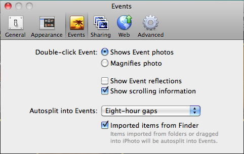
Events Settings

I always use the Import All... button to get everything off the card quickly. You don't want to mess around with picking out images while they are still on the card. Just get them onto your hard disk and have iPhoto wipe the card when prompted. (Note: if you are really paranoid, you can kick off a Time Machine backup when iPhoto shows the Delete photos from your card? prompt.)

Step 2: Event Merging & Splitting

The first thing I do once I have the images in iPhoto is clean up the boundaries between events. Usually, with the 8-hour gap setting above, iPhoto gets it mostly right, but depending on the shoot it might split them up too finely or clump multiple things together. If the photos are from a multiple-day trip somewhere, I prefer not to put them all together into a single event, but rather have each event in iPhoto represent an activity or episode of the trip. (Note: one advantage Aperture has here is the ability to group events into folders. In iPhoto you just have to rely on the chronological proximity of the events to keep them together. However, I don't find this to be a problem at all.)

The best way to do this is on the Last Import view that is shown automatically after importing. Make sure you have event titles displayed (View > Event Titles). Just use drag-and-drop to merge events, and the Split button at the bottom of the screen to split them. Give the events titles – preferably the title you would use to publish a Set to Flickr.

The rest of the workflow is per-event, which is useful for breaking the work of processing images into manageable chunks.

Step 3: First Pass - Picks and Garbage

This step is equivalent to the "stack sorting" and "rejection" steps of the Aperture workflow, rolled into one.

I select the first image in the event, and hit the Space bar to blow it up to fill the iPhoto window. Then, I simply use the Left/Right arrow keys to quickly flick through the images, and the Delete key to "reject" unwanted ones.

This works great for "stack sorting", because it is very easy to find a sequence of shots that are very similar (e.g. where I have been trigger happy with the high-speed shutter on my 50D). I love being able to quickly flick back and forth between shots in-place to decide which is better. I find that comparing images side-by-side makes this harder, but by flicking between shots in full-screen lets me keep my eyes on the focus point, or notice subtle differences.

The reason I delete the non-picks is because I never want to see them again. If I make a mistake, I can easily fish them out of Trash. Better yet, when I finish processing a session I can empty the Trash and recover tons of disk space.

Apart from non-picks, I also use this step to get rid of "rejects", i.e. photographic failures like closed eyes, unrecoverably wrong exposures, out-of-focus shots, and accidental shots.

The key with this step is ruthless efficiency. I want to cut down the number of images as early as possible, so I try to rip through them quickly and just delete as much as I can stomach.

iPhoto just wraps around when it gets to the end of the event, so keep an eye out for that to avoid going through them all again. You can always hit the Space bar to quickly go back to thumbnail view to check where you are.

Step 4: Second Pass - Name Faces

The Faces feature in iPhoto '09 is pretty good but not 100% automatic, so you need to actually confirm the faces it finds. Trying to do this retrospectively over an entire photo library is extremely painful, and the lack of a "show me all the unnamed faces" feature makes it even worse. So I like to get this done on a per-event basis as I add them to my library.

In thumbnail view, select all images with Cmd-A and choose Detect Missing Faces from the right-click popup menu. Watch the little spinning arrows next to the Faces folder, and when it stops, click the Name button at the bottom to go into face naming mode.

I like to use the keyboard as much as possible here. You can press Tab to move through all the faces found in each photo, and type or accept iPhoto's guesses with Enter. Unfortunately I haven't found a keyboard way to remove faces iPhoto has detected; you have to use the mouse for those. And of course you need the mouse to use Add Missing Face.

Step 5: Third Pass - Editing and Losers

At this point, I have weeded out all the photos that will never make the final cut, and iPhoto now knows where all the faces are (which is important, as we'll see). Now we are down to serious photography, so it's time to go full-screen (Cmd-Opt-F) and make use of that nice big shiny Mac monitor. (It might be a good idea to lower the ambient light in the room to minimise reflections on that nice big shiny Mac monitor, too...) At full-screen, this is the biggest the photos are ever likely to be displayed, so if they look good here, they'll probably look good everywhere.

The objective of this step is to make photographic adjustments, and decide the final cut. iPhoto's full-screen mode is its edit mode. I look at each image, make adjustments if needed using the editing tools, and decide if it's a winner or a loser. If it's a loser, I use Cmd-L to flag it as "hidden", which removes it from view and goes to the next image. (Note: if iPhoto doesn't move to the next image when you hit Cmd-L, you probably have it set to display hidden photos. Use Cmd-Shift-H to turn this off.)

A few tips for making adjustments:

  • If you shoot in RAW (you should if you can), you can recover a tiny bit of detail from washed-out areas by holding Option when using the Adjustments window. The Exposure slider changes to a Recovery slider.
  • The magic wand Enhance button is pretty damn good considering the difficulty of its job. I often use it as my only edit, or at least as an excellent starting point. It is particularly good at finding the correct white balance.
  • Having all the faces identified is a big help for editing, since photos containing faces automatically have the Avoid saturating the skin tones option checked.
  • Cropping is often a great edit. iPhoto's cropping tool includes the 3x3 grid so you can find those "rule-of-thirds" sweet spots. But don't crop too much, because obviously this will reduce the resolution of your image.

I try not to make too many edits, because it reduces overall image quality (no matter what tool you use), and as a general philosophy I think it's better to try to get good shots to begin with. If I find a photo is still not satisfactory after 3 or 4 edits, I usually give up on it and mark it as a loser.

Update: As pointed out in Larry's comment below, it is important to note that editing doesn't affect the quality of the original image at all. You can always revert to the original if you mess up. The point I was trying to make here is that trying to squeeze too much out of a photo with edits can impact the output image quality.

Step 6: Pick of the Shoot

By this time, I usually have a favourite shot in the event, or at least a couple of candidates. I go back to thumbnail view, maybe preview them with Space if I need, and choose my overall best shot. I make it the "key photo" of the event by right-clicking and choosing Make Key Photo.

The nice thing about this is it means my Events view is automatically a single view of just my best shots.

Step 7: Places

I don't usually bother to get my places down to exact coordinates, so at this point I finish off the event by going back to the Events view and clicking the little "i" icon in the corner of the event tile to set a location for the entire event. This will apply to all the photos inside.

Step 8: Publish & Share

As I've noted before, it's important to get your photos polished and put them out there as soon as possible after the shoot. Personal photos are like fruit; they are much better fresh.

Since iPhoto has built-in ability to share on MobileMe, Facebook and Flickr, and it can even keep the online albums up-to-date automatically, I tend to just publish to all three. In a way, it's like having three online backups of all my photos in addition to my Time Machine – that's pretty safe!

I also like to create & purchase photo books from Apple if I want to keep the photos out on my coffee table for visitors, or send a copy as a gift to people who were on the trip with me. This is especially suited to non-technical family members.

You could even make a slideshow and export it as a movie for iPhone, MobileMe, YouTube, or a DVD. Whatever it takes to get the photos out into the world where they will actually be seen. After all, that's the point isn't it?

OK that's it! Repeat steps 3 to 8 for each event.

Ratings

Although iPhoto has the same 5-star rating system as Aperture, I find I don't really need them. The rating system most Aperture users recommend maps to my iPhoto workflow as follows.

  • × (rejected; something photographically wrong) = Trash
  • Non-pick of stack = Trash
  • ★ (technically OK) = Hidden
  • ★★ (might be OK with processing) = Hidden
  • ★★★ (Flickr-worthy) = Not hidden
  • ★★★★ (pick of the shoot) = Key Photo of event
  • ★★★★★ (one of all-time best) = "Best Shots" album

I have an album set up called "Best Shots", where I put my all-time best pictures. I don't use Albums for anything but this, as I find Events have pretty much replaced them functionally.

So there you have it – that's my iPhoto workflow. I hope you find this helpful. Let me know what you think in the comments.

Friday, May 07, 2010

Going Back to iPhoto... Sorry Aperture

back2iPhoto.png

I wanted to love Aperture 3. I really tried to love it. But after giving it a very decent chance, I have to say it hasn't floated my boat. That is to say, it hasn't offered a significant value proposition over iPhoto – certainly not ~$200 worth.

Aperture 3 was basically a catch-up to iPhoto '09. It improves slightly on the Faces and Places features that iPhoto '09 introduced, but the improvements are small UI changes which would be – and probably will be – easily adopted in iPhoto '10 when it comes out. But I can't shake the feeling that this is lipstick on the pig. Aperture 3 looks gorgeous, like a true Apple UI. But it can't match the intuitiveness and minimalism of iPhoto '09.

Maybe I'm missing something important, but the main advantages Aperture 3 offers over iPhoto '09 seem to boil down to the following:

  1. Stacks
  2. Editing
  3. Workflow
  4. Um....

Stacks

This is a nice workflow feature for the first pass over a shoot when you get home. It is especially useful if, like me, you like to set the camera to rapid-fire and hold down the shutter button.

But unfortunately the UI for stacks is very finicky, and the end result is I have huge numbers of photos on my hard drive that I don't and will never want.

The equivalent in iPhoto is really simple. All I do is use the space bar to preview the image at maximum size, and use the left & right arrow keys to compare them, and just delete the non-pick-worthy ones. They go to iPhoto's Trash folder, so if I make a mistake I can easily undo with a simple Cmd-Z.

Editing

Without a doubt, Aperture 3 is a fantastic photo editing tool. The sheer number of adjustments and controls available is incredible, and the UI for applying them is genius. I love the way they can be added and removed, previewed, brushed in & out and feathered, the edge-awareness, batch editing, etc. Just brilliant.

But in reality, when I come home from an overseas trip with 2,000+ images to process, I can't realistically spend a lot of time fiddling and tweaking the photos. Usually, if it's not a good shot straight off the camera, it goes in the bin. I also find that the quality of photos generally declines as you play with them. The bottom line is: If it's a bad photo to begin with, no amount of editing will make it a good photo.

But for what it costs (nothing), iPhoto is no slouch at editing either. If you have a good photo to begin with, iPhoto gets the job done extremely well.

One often-cited advantage of Aperture 3's editing is that it is non-destructive, i.e. the original "master" photo stays as-is, and all the edits are stored as tiny metadata and applied dynamically every time you view or export the image. This is certainly elegant, but the argument that it saves disk space is ridiculous when you consider that behind every stack there are photos you will never use, and behind the default "Unrated or better" view are hundreds of "Rejected" photos you never even see, all stored on your hard disk. The benefit of iPhoto's approach is that it's very fast to view and export.

Given that I went and paid for the damn thing, I'll keep Aperture 3 around for the occasional special editing task.

Workflow

I don't really see a workflow emerging from Aperture 3 - it is just a tool; you still need to come up with your own workflow that uses it. I had a pretty smooth workflow in iPhoto (perhaps the subject of another post) which worked just fine – in fact it was as good if not better than the most commonly recommended workflow in Aperture.

But the most infuriating things about Aperture's workflow are the beginning and the end.

The import process in Aperture is intensely unsatisfactory. In iPhoto, you plug in your card or camera, and it immediately recognises it and displays the import screen. In Aperture, there are a lot more clicks.

After the import, iPhoto asks you if you want to delete the photos from the card. So does Aperture, but for some reason it asks you twice, and then it doesn't even seem to work – every time the card is ejected before it is wiped clean.

In iPhoto, once you've done an import, you're done. For some reason, Aperture spends ages "Importing" the photos after you've pulled them off the card. And while this is happening, the performance of the application – no, the whole computer – suffers noticeably.

But much worse than import in Aperture is how you actually use the photos for something useful after processing them. Aperture 3 inherited the Flickr, Facebook and MobileMe support from iPhoto '09, and it's basically the same, but iPhoto remembers what you've uploaded and you can easily control the online albums from right within iPhoto.

iPhoto has a very fast file export as well, probably due to the pre-rendered edited copies of each photo that it has; but Aperture seems to take forever to export images.

The most annoying thing of all is the integration with the rest of the Apple universe. iPhone (and presumably iPad) syncing is fantastic with iPhoto, but pretty much sucks balls with Aperture. All other applications on the Mac know how to get photos from iPhoto, but not Aperture. Even the Mac screensaver doesn't seem to know how to use the filters in Aperture.

Um....

I'm sure there are a lot of other features in Aperture that I've overlooked and/or not discovered in my 3 months of usage. But if those features are so great, why were they not discoverable? I watched every inspiring introduction video on Apple's website...

Maybe Apple isn't Good at Pro?

I can see how Aperture might have made sense before iLife '09, especially for those who have truly huge libraries and needed a way to organise them, but with the tiny amount of effort it takes to use Faces and (to a lesser extent) Places in iPhoto, there really is no rational reason I can think of to do any manual organising anymore.

I had a similar, if not more extreme, reaction to Final Cut Express vs. iMovie. I'm starting to think that while Apple excels at casual, consumer-level software design, they are not so good at the professional stuff. In the case of Final Cut, it was patently obvious that there is a backward compatibility problem: (Probably) thousands of professionals make their living with Final Cut, so Apple can't afford to mess up their workflows by changing the UI, even if it is a huge improvement. Perhaps the same is true for Aperture.

iLife apps don't have that problem, so both iPhoto and iMovie got major changes in '08 and '09, and are now much, much better as a result.

And now we are seeing some seriously functional stuff on iPad... I am getting the impression that Apple's special talent is to provide all the functionality in a simple, intuitive, discoverably deep UI experience, which can and should render obsolete the need for "Pro" applications.